It’s tricky to think of every possible data element a user can mess up during, say, order entry. Fortunately there are a number of front-end mechanisms to gently coax users into getting the correct values entered into your various fields before they click the Save button. One such element involves a new configuration on the date-picking tool, which can be utilized on any form containing dates.

In this month’s tip, we’ll look at a simple way you can configure a date field to prohibit specifying certain days of the week, so you can put an end to situations where a user has specified a Sunday as a shipping date, or entered a due date in the past by mistake.
And if you’re into short and quick reads, you’re going to be quite pleased with this simple “feature awareness” piece!
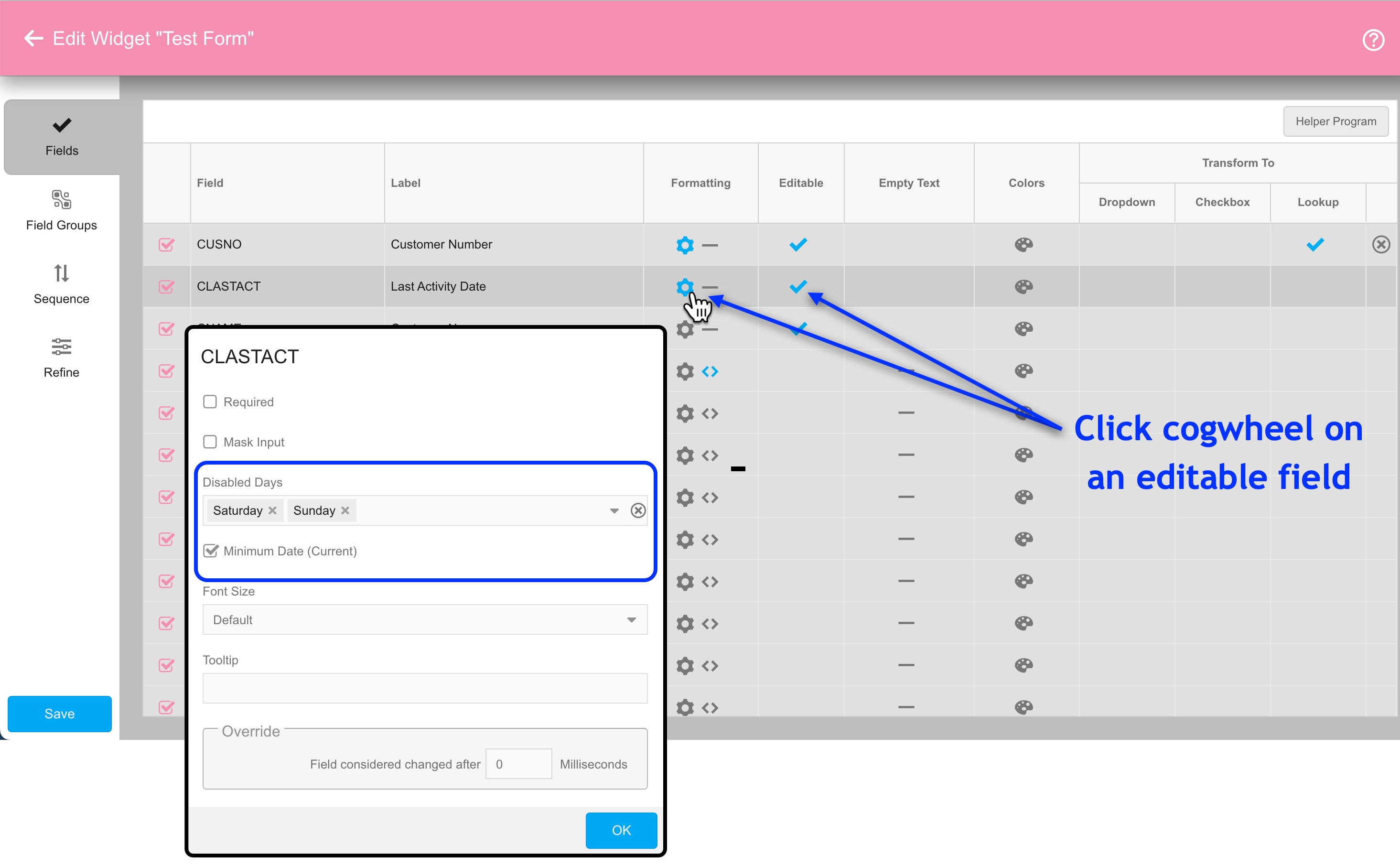
Introduced in build 6.2.20230630, editable date fields inside Form widgets now include two new configuration options:
- Disabled Days – here you can select up to six days of the week that should show as disabled when the user is looking at the date picker
- Minimum Date (Current) – when checked, users will be prohibited from specifying any date value prior to the current calendar date
Note that if a date is pre-populated with a value that violates either of these settings, then the form will be considered to be “in error” from the moment it’s presented to the user. In such cases the user must correct the date(s) in violation before then can proceed.
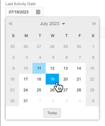
The resulting appearance for a date picker with the above constraints will show all Saturday and Sunday dates, as well as all dates in the past, as disabled.
For date-specific individual calendar days you don’t want users to specify, such as holidays, you would need to trigger exception messages to show when appropriate via your form’s back-end validation program.
And that pretty much concludes this simple tip for limiting users to valid dates. While we’re here, let’s review the remaining configuration settings available on this date field:
- Required – if checked, the date field must be filled in before the user can accept the form.
- Deferred Validation – this checkbox appears when the “Required” setting above is checked. When “Deferred Validation” is checked, the contents of the field are not immediately validated whenever the users tabs or clicks out of the field, but rather when they attempt to save the form.
- Font Size – controls the text size of both the field label and the field contents.
- Tool Tip – if filled in, this text will be made available in the form of a clickable tool tip. This provides space to explain to users what information should go into the field (in this case, what the date field signifies).
- Override: Field considered changed after __ microseconds – if a value is specified here, validation on the field will not take place until this many microseconds have elapsed since the last keystroke was made. This setting does not apply when “Deferred Validation” is active.