If a picture is worth a thousand words, a multi-row grid with embedded cell images could be worth… millions!

Most users are well-accustomed to the humdrum of spreadsheet-like grids loaded with row upon row of text. In some cases overrides to fonts, text colors or cell background shades can effectively draw attention to abnormal or unique values.
But your grid cells need not be confined to mere words and numbers alone! If your grid includes a column that can be depicted with an image, such as a trend (increasing / decreasing), an abnormal condition (discontinued / out-of-spec / over credit limit / etc.), or any other simple concept, you can easily replace text with an image that visually represents the concept. Such cells will draw more attention by virtue of not being plain text.
Though any kind of HTML markup is permissible within a grid cell, this post will cover just two common types of visual elements that are easily incorporated into Nitro App Builder (NAB) grid widgets: (1) Icons, and (2) image files. Icons are buffered in memory and hence more efficient to render inside your grid, while images tend to be larger and slower to stream and load (so using scaled-down images is highly recommended).
Let’s review the two approaches:
Embedding Icons in a Grid Cell
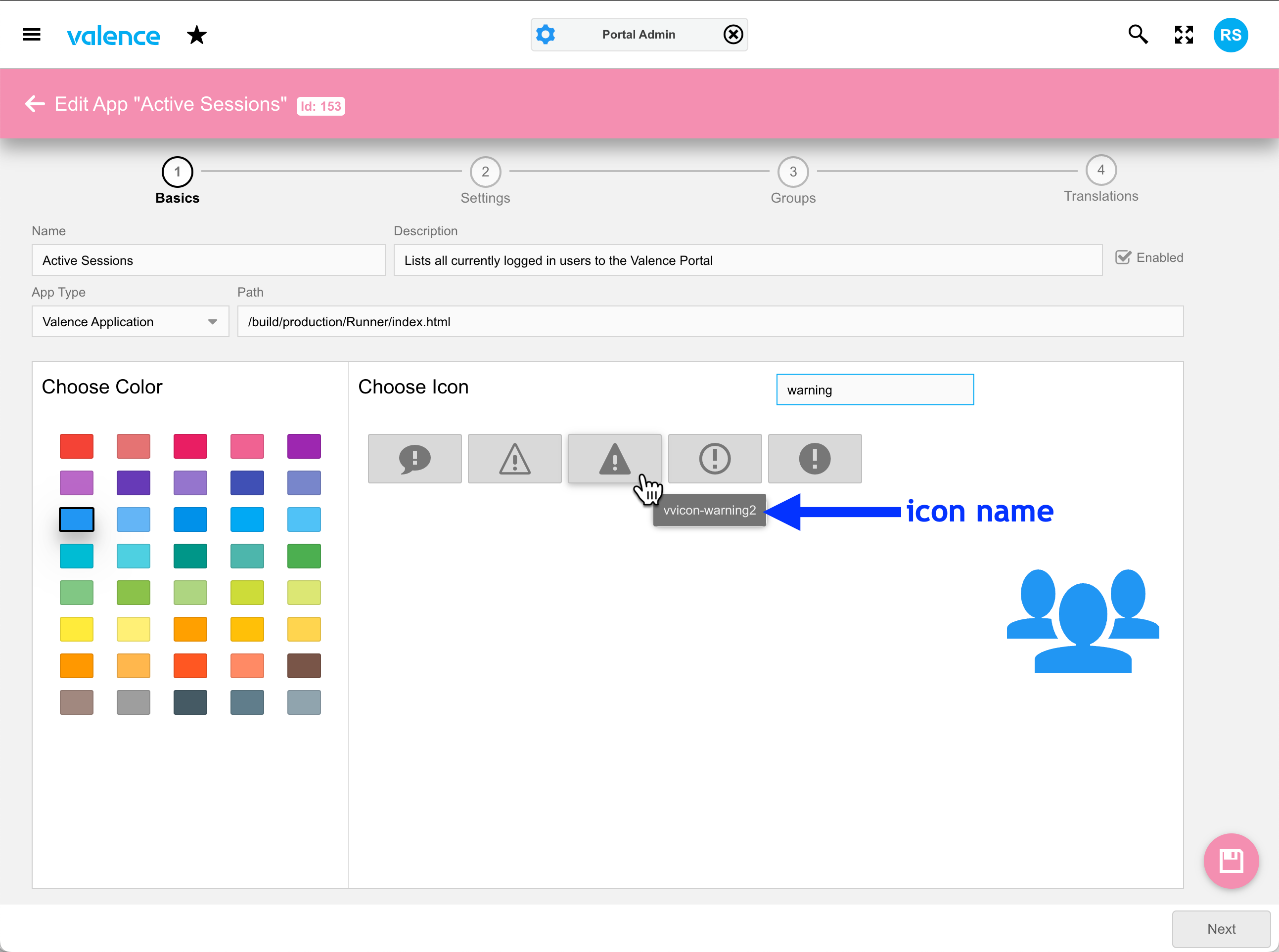
Valence comes with its own set of icons that are used to represent apps in the Valence Portal as well as button images and grid icon columns in NAB apps. You can see these in Portal Admin > Apps, where you can set up an app’s settings, as well as within NAB when adding a button or icon column in Behaviors.
If you’re interested in using one of these icons that are already conveniently included in the portal, an easy way to get to the name reference is by calling up any app in Portal Admin > Apps, finding the desired icon in the “Choose Icon” section, then hovering your mouse over it. The reference name will show briefly as a tool tip, as shown here:
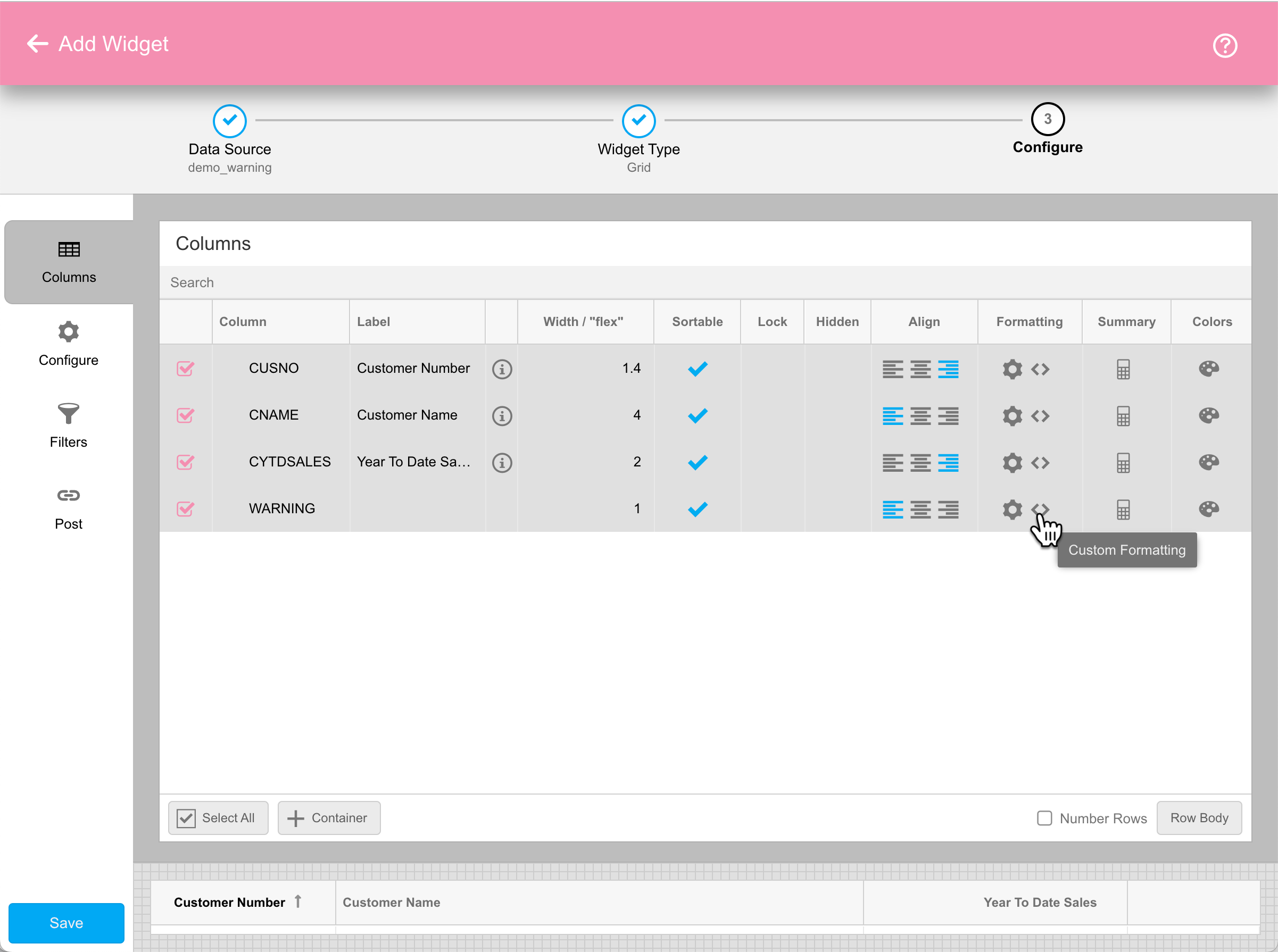
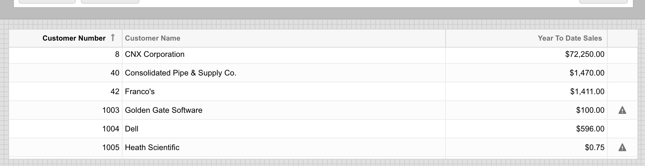
The next step is to incorporate this icon into the appropriate grid widget column. Using the warning icon in the screenshot as an example, let’s say you’ve created a data source that includes a column called WARNING, and this column has a value of either ‘1’ or ‘0’ (with ‘1’ meaning a “warning” condition applies). Whenever a ‘1’ is in this column, you want the corresponding grid cell to show the warning symbol, otherwise just leave it blank.
To achieve this we need to go into the grid widget and click on the custom renderer icon for the desired column, as depicted here:
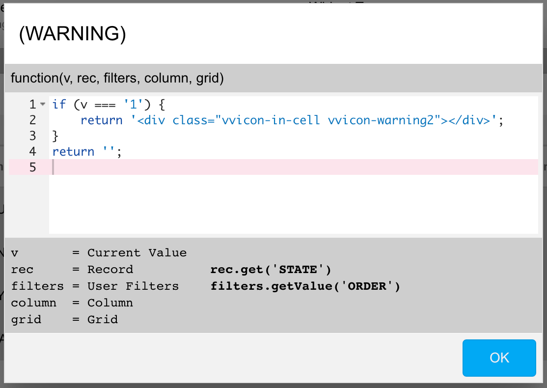
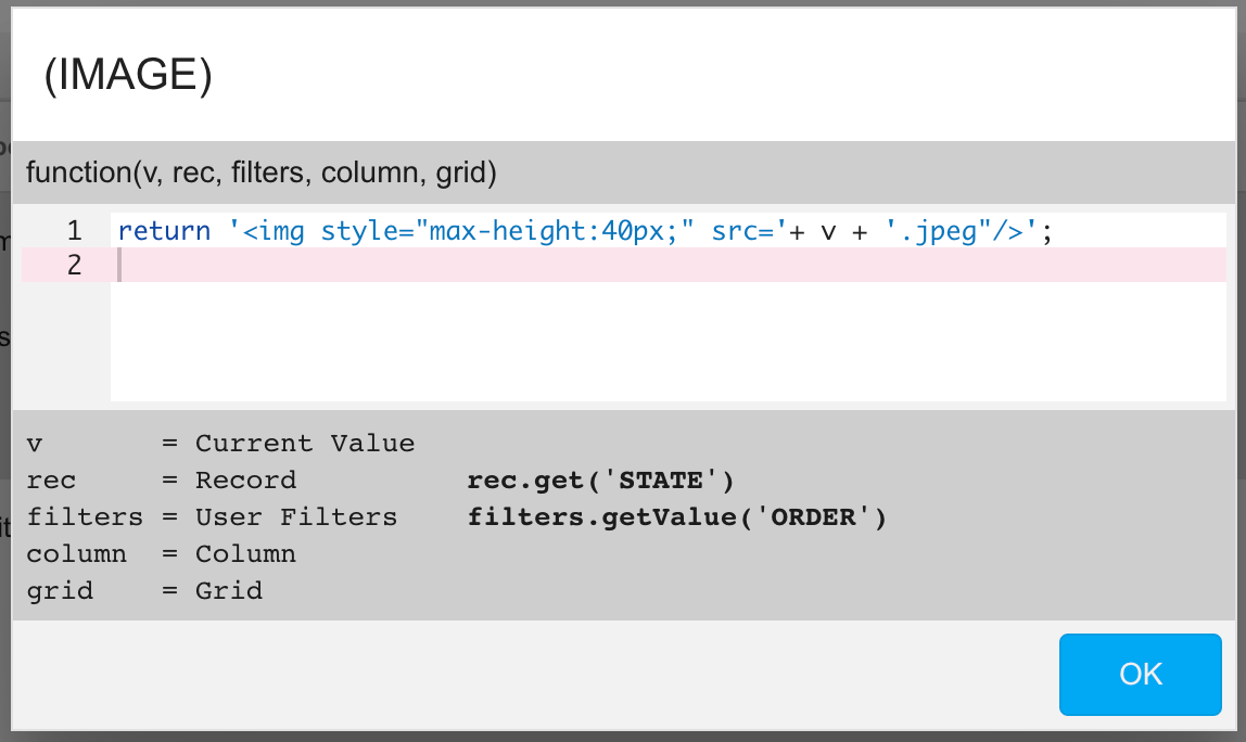
Custom renderers are Javascript functions that allow you to provide your own Javascript to override the HTML value that appears in the grid cell. As explained in the bottom of the renderer window, the “raw” value of the cell coming from the underlying data source is passed as v, while a reference to the entire row (record) is passed as rec.
For our purposes, we want to conditionally override the cell value with the warning symbol image whenever the value passed in (v) is ‘1’. NAB includes a special styling class (CSS) for properly sizing icons within grid cells called “vvicon-in-cell” which we can use to size the icon appropriately. So to get the warning icon to render in the cell whenever the value is ‘1’, we would want to structure the renderer inside a <div> tag like this:
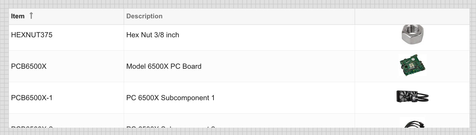
In this case we’re returning either a warning icon or a blank cell. But you could structure your renderer to return any number of different symbols based on specific values by adding additional conditions to the Javascript code. You could also determine what icon to show based on values from other columns on the row using the rec.get(‘column_name’) function. The resulting image in this example draws attention to customers with less than $500 of sales:
Embedding Images in a Grid Cell
Like icons, image files can also be embedded in grid cells, but keep in mind that images can impact load and rendering performance if they are of high resolution. Also keep in mind that images shrunk down to fit into grid cells will naturally be considerably less detailed than when rendered in a larger size, so you generally wouldn’t want to use images that would be indiscernible at small scale.
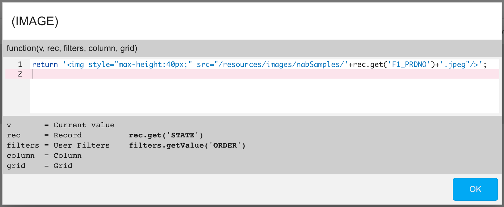
With those caveats in mind, embedding an image is a simple case of providing a path to an image that can be streamed to the user’s browser. That path could be a file in a directory on the IFS (authorized per the Apache settings on your Valence instance, along with the user’s authority) or a path from an external website. If your data source is providing the full path, then all you need to do in your rendererer is wrap that value (v) inside its own <img> tag, with appropriate styling to scale the size appropriately, typically using “max-height” or “max-width”:
In cases where the path should be structured based on the value of another column, like the part number, you can reference that column via the rec.get(‘column_name’) function, like this:
The resulting embedded images should provide some nice visual flair to your grid, but keep in mind the vertical size of rows containing images will typically be a bit larger than usual (depending on your styling settings) to accommodate the images…