If a picture is worth a thousand words, how much more valuable is a button with an icon on it, compared to a string of words nested inside a row menu? While a thousand times valuation differential may be a stretch, there’s no doubt that a visible action button on a grid row is going to be considerably more intuitive to users, particularly new users who are exploring apps for the first time. Such buttons also offer the added value of requiring one less click to trigger a row action.

Effective with the latest Valence 5.2+ builds, you can now add action buttons to your Nitro App Builder grids for users to take an action such as calling an RPG program, drilling into another view, etc. As with standard row menu buttons, the Behaviors function within the app, not the widget, is where you configure the icon buttons and define their respective actions.
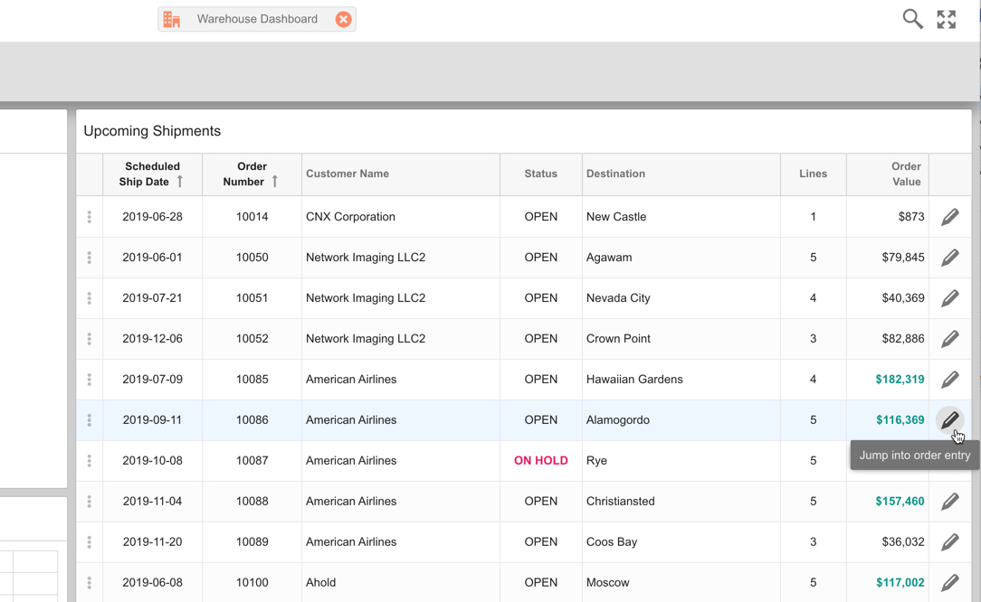
To illustrate the use of icon buttons, let’s play with the Warehouse Dashboard example app that’s included with Valence. If you launch the app in its current form, you’ll see that there’s a row menu option on the left edge of the Upcoming Shipments grid. Users click the row menu selector, then click on “Jump into Order Entry” to launch the Order Entry app and edit the selected order number…
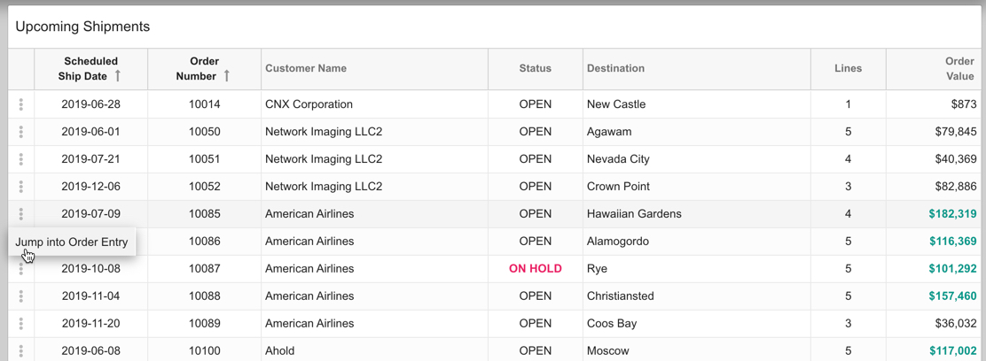
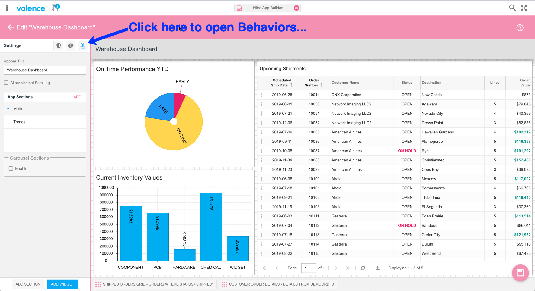
As you can see, to jump into order entry here requires two clicks – one to open the row menu list (for which there happens to be only one option), and then another click to make the jump into the Order Entry app. Let’s change that to a visible icon button so it becomes a one-click action. To do this, go into NAB, switch to the Apps list and open up the Warehouse Dashboard app. Remember that in order to see the example apps you’ll need to click on the cogwheel at the top of the page and select “Show Examples”…
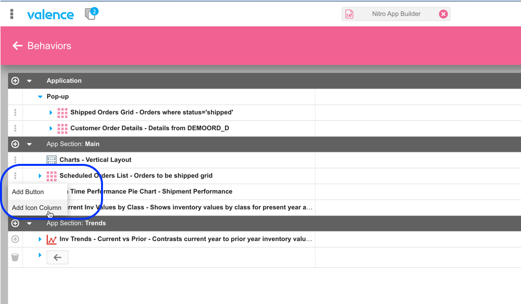
Click on the Behaviors icon, then click on the row menu adjacent to the Scheduled Orders List grid and select Add Icon Column.
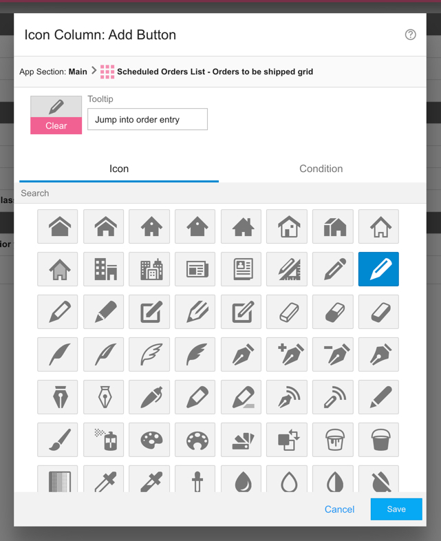
You can then select an appropriate icon for the action and, optionally, a hover tip for added context…
The behaviors list now includes an “Icon Column” section under the Scheduled Orders List grid. Expand it and click on the “On Click” row menu option, then click Launch App. This will tell NAB to launch another app when the icon is clicked…
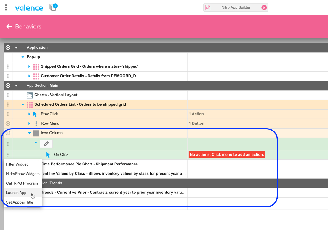
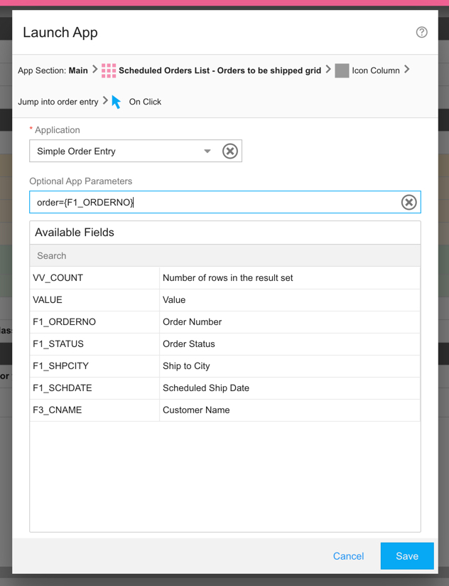
Now we just want to mimic what the original row menu option for this app was doing. So we select the Simple Order Entry app and insert the appropriate app parameters so that the order number is passed into the app…
Note that you won’t see the new icon within the NAB designer, since it’s a behavior-based addition to the widget. So go ahead and save the app, then launch it and you’ll see your new icon column appears in the grid, ready for users to click it…
As you can see, the app now has a more intuitive way to trigger actions from within a grid. You could add additional icon columns as well, each with its own unique icon, to accommodate scenarios where users can take more than one action.