When creating an app to convey a typical collection of IBM i business data to users, the most common approach using Valence’s Nitro App Builder tool is to build an SQL statement to pull in the pertinent information, pop the resulting rows into a multi-column grid, give the user a few filter options and call it a day.

For apps containing quantifiable numeric values — such as sales numbers or unit volumes — the core grid can be supplemented with a chart or graph, thereby adding a visual emphasis to trending values.
But what about illustrating date-specific information? That is, what if there’s a story to tell focusing on when something happened, or how long something took, rather than merely listingrows and columns of dates.
This is where “timelines” come in. And thanks to the new Timeline widget recently introduced in NAB, you can now quickly build out an app that depicts date-sensitive events to highlight, for example:
- How long it took a customer order to go through its various statuses in the order cycle
- How often a particular item is being ordered or shipped in your warehouse
- The frequency for which a certain action, like cycle counts or quality inspections, are being performed
- The span of time it took to perform various routing steps in a work order
Rendering date events in a timeline will more effectively draw attention to time-sensitive matters occurring in your business. Like other NAB widgets, if you know where the relevant dates are stored in your IBM i database then you can have them rendered in a timeline in (pardon the pun) no time.
To begin the process you must first create a data source containing, at minimum, a date and a label for what the date represents. For timelines that depict a date range you must also include a second date field, which would serve as the end point of a time range. Note that the date must be a true date (L) or timestamp (Z) field. If your dates are rendered in a numeric format like YYYYMMDD, you must convert them to a proper date using SQL (i.e., via the TIMESTAMP_FORMAT function — see examples here).
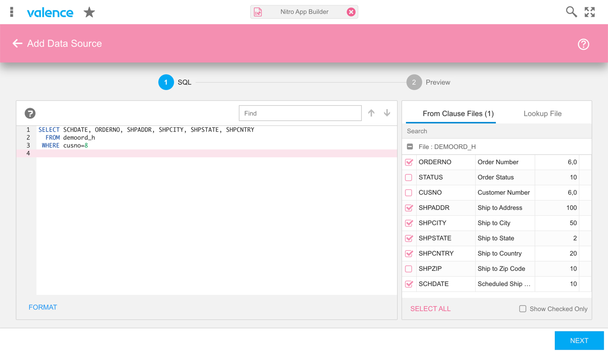
As a simple example, we’ll use the DEMOORD_H file included in Valence to create a datasource of customer orders and scheduled ship dates entered for customer number 8 (click here for instructions on creating an SQL-based data source). We’ll also include the shipping address:
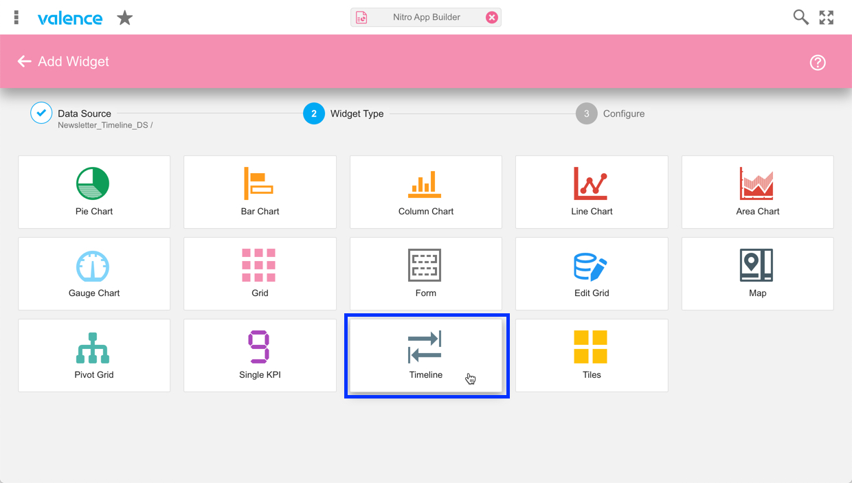
Next, we’ll create a Timeline widget over this simple data source. After selecting the “Create Widget” menu option on the data source, click on “Timeline” to begin the configuration:
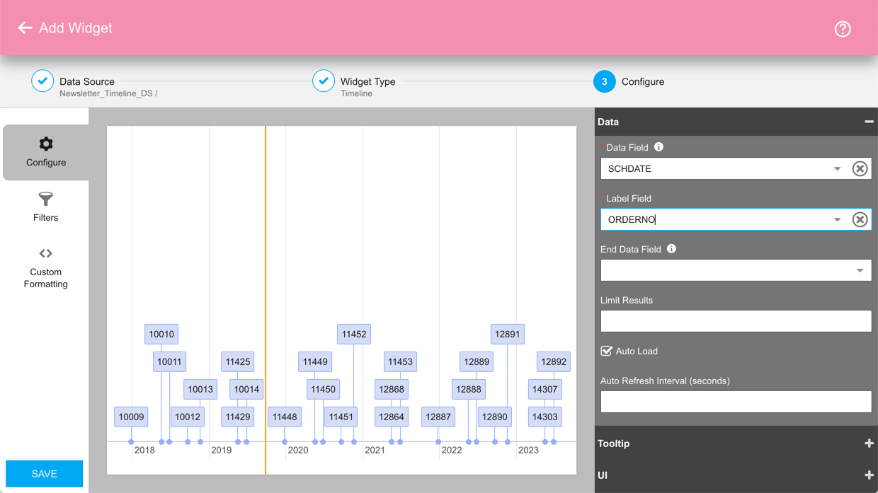
We’ll begin in the Data section by specifying the date field (SCHDATE) as the Data Field, and the order number (ORDERNO) as the Label Field. The orders will then be laid out in the preview panel in chronological sequence:
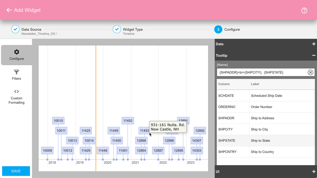
For added interaction, we can add the ship to address as a tool tip, so users can see where the order is going by hovering their mouse over the order number. In this case we’d do that by adding the fields and appropriate separators in the Tooltip {Name} section:
There are additional bells and whistles you can add to the timeline widget, including custom formatting and ending date values that convert the data points to ranges. Click here for the full documentation.
Then of course, you can add the widget to an app. A timeline section or popup can add some wonderful color to a simple grid app. Click here for step-by-step instructions on this process.
![CNX_logo [Converted]](https://0pkef6.p3cdn1.secureserver.net/wp-content/uploads/2023/05/CNX_logo-Converted-2.png?time=1714271454)
![CNX_logo [Converted]](https://0pkef6.p3cdn1.secureserver.net/wp-content/uploads/2023/05/CNX_logo-Converted.png?time=1714271454)