Imagine going to a buffet and being told you can only choose ONE item for your plate, and if you wanted more you’d first need to take that single-item plate back to your table, consume it, then return for the next item. Wouldn’t it be great if you could just load up your plate with two, three, four items or more and consume them all at once?

To put that into an IT context, when confronted with a list of filter values, traditionally users pick one value then see the underlying widget filtered to that value. But sometimes users have a need to amalgamate data filtered from multiple values, and effective with Valence 6.0 you can now facilitate that in NAB filter combo boxes (aka, dropdown lists). This is done via a new “Multi Select” option on the configuration for a lookup field, which can be applied to both widget filters and form fields.
To illustrate the process, let’s whip up a quick grid app over the demo customer master file included with Valence called DEMOCMAST, wherein we’ll allow users to select one or more countries from a drop-down combo box filter. We’ll start the process by going into Nitro App Builder and creating a simple data source over DEMOCMAST that pulls in all the existing countries in the file via this SQL statement:
select distinct CCOUNTRY from DEMOCMAST order by CCOUNTRY
Save that data source — you can call it DEMOCMAST Countries — and we’re ready to move on to starting the grid app. This time let’s just select all the columns from the same file via this SQL statement:
select * from DEMOCMAST order by CUSNO
Save that data source — you could call it DEMOCMAST — then start the process of creating a grid widget over it. The configuration page should thus look something like this:
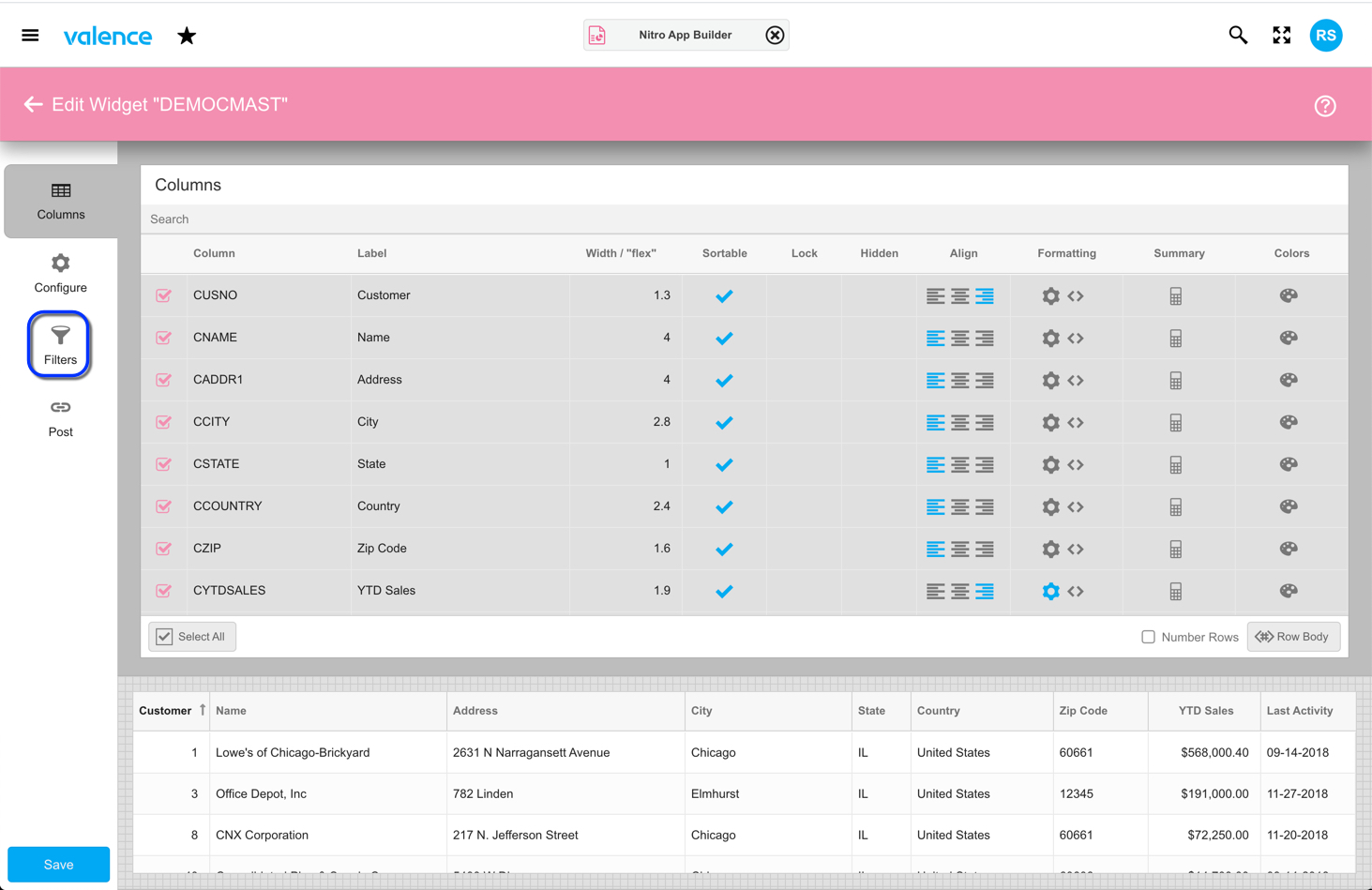
Now we can add our new multi-select combo box filter. Click on the filters icon on the left, then select the CCOUNTRY row and click on the Dropdown cell to indicate we’re creating a dropdown-style combo box…
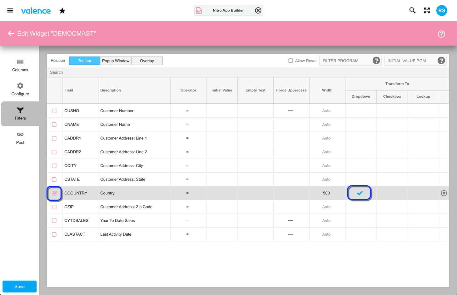
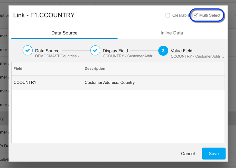
Upon clicking the dropdown cell, you’ll be prompted for the data source (the “DEMOCMAST Countries” one we created earlier) along with the display and fields (CCOUNTRY in both cases). The key final step is to click on the “Multi Select” checkbox in the upper right, as this signals that users should be allowed to select more than one value from the list. Note that you may want to make the width of the filter wide enough to accommodate multiple selections gracefully. In the prior screenshot, you can see that the width was set to 500 pixels rather than the default vaule of Auto.
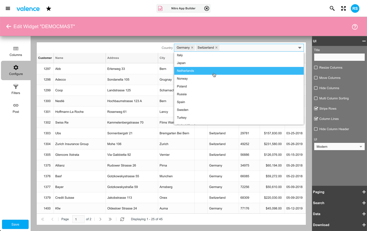
You can see the impact of this immediately by going to the Configure tab. The multi-select combo box is in the upper right and can be tested even before you save the widget and create an app.
This same Multi Select concept can be applied to form fields as well. Your users should be quite grateful that they can now load up their plates with multiple items in a single pass!