Note to Valence 5.* developers: Please reference the Valence 5 User Guide for more recent information on customizing your Valence 5 portal instance. Out of the box, the web portal included with Valence Framework 4.0 provides a great foundation for building up your repository of IBM i-based web and mobile apps. But many developers quickly find they want to take things a step further and give the portal a look and feel that is more reflective of their corporate identity. Simple aesthetic tweaks, such as adjusting the title that shows in the browser tab and switching out the Valence logo with your own company logo, can quickly transform the portal into an interface that feels like a natural extension of your IT infrastructure. Such adjustments can help forge “buy in” from your users as they transition from green screens to web apps one program at a time.
Here’s how to get started:
1. The Simple Elements Some of the easiest changes to the Valence Portal appearance can be made right inside the Portal Admin app. To do this, simply log in to the portal, launch the Portal Admin app, click on “Settings” and scroll down to the “Portal Appearance” section.

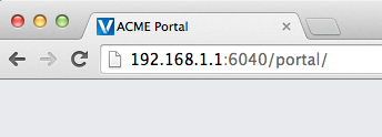
The title that shows in the browser tab is set in the “Title on browser tab” setting. While the default value of “Valence 4.0” has relevance to those of us in the IT world, to the average user this may not be terribly meaningful. So consider changing it to something your users would recognize. For instance, if your company is called ACME Manufacturing, then a browser title of “ACME Portal” might resonate a little better.
And what about that “V” icon left of the text, you ask? If you have a custom icon (.ico file) for your company, you can change the browser tab icon — referred to conventionally as a “favicon” — by replacing the favicon.ico file located in valence-4.0/build/production/Portal/resources/images. This file will not be overwritten on future updates, so once you replace the file it will stay that way. You can also control some of the text elements of the portal’s login window through Settings adjustments. Unchecking the “Multilingual Active” checkbox will remove the “Select Language” link, and unchecking the “Allow users to self-reset passwords via email” checkbox in the “Login Method” section will turn off the “Forgot Password” link. Other quick changes you can make while you’re in Settings: Unchecking the “Show app icons on each portal tab” checkbox will exclude the miniature version of the app icon from showing on the app tab when launched (changes made to this setting take effect on the next login); The date format that shows in all Valence apps, and any custom apps that use Valence.util.Helper.formatDate, is controlled by the “Date Format” setting.
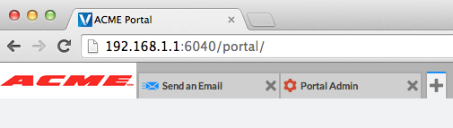
2. Graphical Elements (Logos) There are three areas of the Valence Portal where graphical Valence logos are used by default. The logo is shown on the initial login page, the upper left of the portal after logging in, and on the session lock screen.
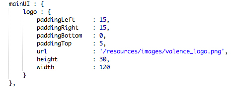
To change which images are shown in these areas entails updating a file called Hook.js, which for the desktop portal is located on the IFS in your Valence directory (i.e., valence-4.0) under resources/desktop. By modifying the listeners and configuration settings in Hook.js you can customize many elements of your portal while retaining the flexibility to apply Valence updates as they’re released, as Hook.js is not overwritten when Valence updates are applied. The Hook.js elements that control the login, main portal and lock screen images are located, respectively, in loginUI, mainUI and lockUI. Look for the “logo” object within each of these elements and start by adjusting the “url” property to point to your own graphic file.
For example, the default mainUI code looks like this:Depending on the size and structure of your graphic, you may need to tweak the padding, height and width settings to get the logo to fit properly. So expect to make several tweaks to these settings, saving and then reloading the portal until you get it right. Keep in mind that higher resolution images will generally look best. Note that if you make any changes to any of these UI elements in Hook.js, you must scroll to the “settingsapplied” listener and uncomment the appropriate line of code in order for your adjustments to supersede the portal’s defaults. For example, if you changed any part of mainUI, then you would need to uncomment the “Portal.config.UI.setMain(me.mainUI);” line. Further info on Hook.js is available in the Valence API documentation. Also be sure to check out the Valence Forum for examples of other elements in the Valence Portal being tweaked through Hook.js adjustments (search for “Hook.js” to see a list of applicable threads).
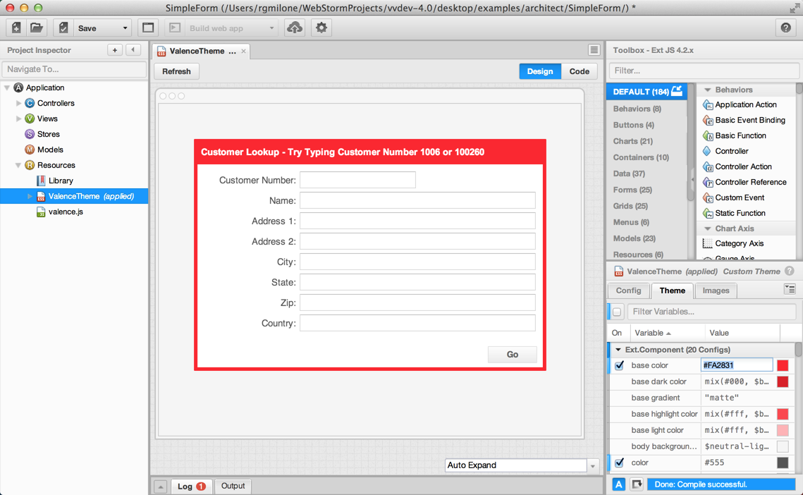
3. Theme Adjustments Out of the box, Valance 4.0 uses a variation of the Ext JS Neptune theme for the portal and all included apps. If you use Nitro AutoCode to create apps (or to start apps for modification in Sencha Architect), then you’ll notice this same theme is included in the Resources section of each of your apps. The Valence Theme employs a popular and relatively neutral blue/white/grey color scheme that is suitable to most sites. But if your company’s website or product literature uses a color scheme that is considerably different from this combination, then tweaking the theme so your apps complement it may be worth your time. Say your company, ACME Manufacturing, uses a mostly red on white theme and would like that look and feel to carry through to all your apps. To do this, you could call up any existing app (i.e., by opening the appropriate .xds file), modify the Valence theme to adopt this color scheme, then save the modified theme. This theme can then be imported into Architect and applied to any apps you like. To illustrate by example, let’s open the SimpleForm example in Architect, click on the “Valence Theme” under the Resources section, then click the “Theme” tab and adjust the base color from blue to red.
Note that there are all sorts of ways to get the appropriate color code (#FA2831 in this case). One of our favorite ways to do this is by using a color sampler or eye dropper tool to get the appropriate hex code from a logo or other solid colored graphic image on your company’s web site. Once the new base color is applied, that’s where the magic happens. After a short compile in Architect, the app is re-rendered with the new color scheme — all from just a single color adjustment!
Once you’ve made the desired adjustments, the theme can be named in the Config tab (i.e., to “AcmeTheme”), saved and then imported to Architect (via Edit/Import Component) for use on other apps. The imported theme would then appear in your toolbox, which can be dragged into Resources and applied, replacing the default Valence theme. Of course, there are many more things you can do with themes, which will be fodder for a future blog post. Alternatively, you can make plans to come to Valence training this fall and learn all the advanced tricks in person!